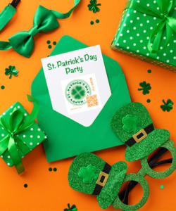


I had the chance recently to sit down with one of the owners and talk with him about the company logos, and there is a lot to them that I cannot put in a single blog. That said, here is how some of the recent conversation went on the creation of the app and the feather logo that represents the most comprehensive attempt to develop a tool to personalize, simplify and bring more fun to the gifting process. From the messaging feature to My Stuff, this app is all about you.
So how does the simplicity of the Penless Feather reflect who we are as a company and convey a message about how we would like you to see us? Ever since the beginning of time the feather has played a roll in history. In  messaging, one thinks of the quill or the messenger pigeon. And since humans have witnessed the flight of birds they have dreamed and in more modern times those dreams have given way to the reality of human flight, taking us to new heights both literally and figuratively, to the moon and to explore the deep recesses of space. But what does any of this have to do with Penless.
When the idea of Penless was born, the name and the logo were not far behind. As the owner reflects, the name and the feather were obvious. A primary goal of Penless is to make the entire gifting process more personal no matter which side you’re on, the giver or the receiver. With all the social media platforms that exist, people have become less personal not more personal. According to the owner, relationships suffer with the conveniences. Much of the gift giving that was so much a part of our culture is drifting. This company wants to take the gifting process to new heights. It wants to be the change agent in this space.
To that end the uptick in e-cards is problematic. So how can a company searching for intervention seek to reach back to pen and paper. Is this about reaching back to go forward? We think it is. The idea of handwriting a message and sending it is quickly becoming the exception and not the rule.
So, the idea of Penless is a bit of a paradox. That is because the concept is to actually promote the writing of cards. But in addition, in the same vain as authors found many years ago with the advent of picture books, that the written word and pictures compliment each other and convey a power sentiment in a way that neither could do on its own. We hold to that principle. And Penless kicks this up a notch because it allows a person to communicate through pictures and sounds as well as words. It weaves together modern technology with the traditions of paper.

And this is where the feather logo comes in harkening back as well, even centuries, when the pen and quill was the instrument of choice for writing. It was used to write biblical passages, the Magna Carter and US Constitution, and many historically significant documents. But a feather also represents ingenuity and science. The study of feathers and wings has informed man how he should fly. The way this specific Penless Feather turns back on itself to form the familiar “P” shape reflects the connectedness that we all have with each other when we care.
The colors are equally deliberate in their selection, and the product of that same thoughtfulness in messaging.
Purple combines the stability of blue and the energy of red. It symbolizes power, nobility, and ambition. Purple is associated with wisdom, dignity, independence, creativity. While the Rose color fading to shades of pink reflects love, beauty courage and respect, appreciation, gratitude, gentleness and grace.
The Penless Feather is intended to reflect the best of who we are and it is intended to guide this company forward as we bring Penless features and products to market.